Use this tool to hold Police Chiefs and Mayors accountable for ending police violence in your city. The charts below use data from January, 2013 through December, 2017 to show which police departments are most - and least - likely to kill people. You can also compare police departments operating in jurisdictions with similar levels of crime to show that, even under similar circumstances, some police departments are much more likely to kill people than others. And after you've explored this tool, click here to learn about police violence in your state.
Key Findings:
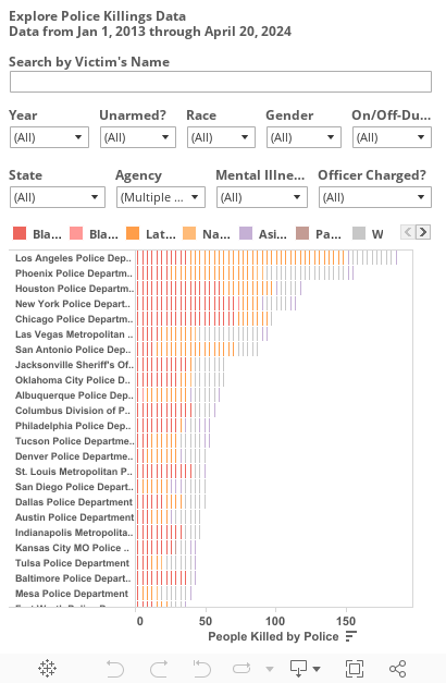
27% of U.S. police killings between January 2013 - December 2017 were committed by police departments of the 100 largest U.S. cities.
Black people were 39% of people killed by these 100 police departments despite being only 21% of the population in their jurisdictions.
Only 1 of the 100 largest city police departments did not kill anyone from Jan 2013 - Dec 2017 (Irvine, CA).
48% of unarmed people killed by the 100 largest city police departments were black. These police departments killed unarmed black people at a rate 4 times higher than unarmed white people.
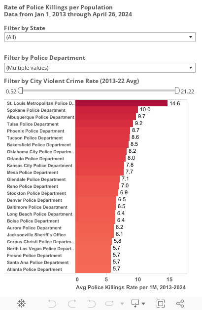
Rates of violent crime in cities did not make it any more or less likely for police departments to kill people. For example, Buffalo and Newark police departments had low rates of police violence despite high crime rates while Spokane and Bakersfield had relatively low crime rates and high rates of police violence.